The influence of architecture: Fitzwilliam College
It was Fitzwilliam’s often under-appreciated eclectic mix of architecture that drew Molly Windust to apply to the College

As far as Cambridge colleges go, Fitzwilliam College isn’t famous for its architectural grandeur. In fact, the Modernist dark brick courts in place of Gothic or Renaissance buildings have often been subject to criticism. However, I would argue that the eclectic mix of architecture and the surrounding gardens creates an open, communal atmosphere that drew me to apply. Fitzwilliam’s 200-year architectural journey is an ongoing one, with over six architects designing various aspects of the college. The original buildings were designed in 1960 by Denys Lasdun, whose vision of Fitzwilliam College remains present to this day.
Each building changes as you follow the spiral around the courts
This vision began with the concept of a snail shell. Lasdun wanted the buildings to be organised in a spiral shape, allowing for a sense of flow. Within the Lasdun spiral the courts are open, not closed, breaking with the classic closed-court Oxbridge architectural tradition. Despite small changes during construction, the college retains a spiral-like structure, unfurling outwards. This helical shape is mirrored across the college, with the cylindrical external wall of the chapel forming the central core of the snail shell. The 2003 Olisa Library tower also has a spiral staircase flowing downwards, filled with desks; here the spiral is repeated internally in the staircase, and externally in the column shape of the library tower. The subtle, intrinsic links between the varying architecture throughout the college unites the structures into one organism. Comically, there are also large snail shaped hedges scattered around the shrubbery.

What seemed imperative to every architect who has worked on Fitzwilliam is the importance placed on the external environment. The gardens running through the courts are filled with cherry trees, whose pink blossom stands delicately juxtaposed to the dark brick. The Auditorium, with a glass box reception, allows for the external to become the internal as the transparent structure lets the large oak and surrounding gardens to almost enter the buildings. The residential blocks seem to act as mirrors for the gardens through the bright green copper cladding that reflects nature. This eclectic mix of architecture and gardens creates an environment of undisturbed quiet, just a minute away from the busy Huntington Road. It was this expansive habitat that drew me to apply to Fitzwilliam.
Lasdun was inspired by Le Corbusier’s use of horizontal structures and planes creating a “play of half lights and heavy shade with the accent running not from top to bottom but horizontally from left to right.” Although heavily influenced, Lasdun deviated from Le Corbusier’s utopian city ideal, the Ville Radieuse, as he believed buildings should have a continuity with their historical surroundings. Lasdun’s use of the horizontal was not only in form but in theory; he attempted to usurp the traditional hierarchy of Cambridge buildings within a college, ensuring that the Senior Common Room was made of glass and therefore visible to undergraduates at all times.

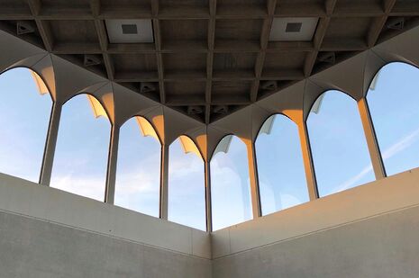
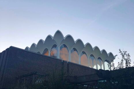
Lasdun’s use of the horizontal is most famously seen in Fitzwilliam in his work on the vault above the Buttery. Rising above the square dining hall is a glass extension, formed by cast concrete intersections enveloping scallop-shaped windows. The concrete seems to mimic tracery seen surrounding stain glass windows in Gothic cathedrals, and the lancet shape of the glass adds to the cathedral-like effect. The height and delicate shape of the roof catches your attention, much like the dome of a mosque or the spire of a cathedral. What makes this structure surprisingly different, therefore, is its horizontal nature. Of course, the Buttery is far from a religious building, but it is a communal one and thus brings people together under this elevated, sculpted construction. Lasdun has managed to make the hall triumphant yet also subtle, delicate and ornate. He has mastered the ability of catching someone’s eye from above, without creating a daunting or overtly intrusive structure.
The structure is transformed by the weather. The scallop-shaped windows in their crystalline transparency allow the sky to be seen through them. The sculptured roof seems to reflect the weather, illuminated with bright blue skies, almost lifting the vault upwards. On more rainy and dismal afternoons the vault stands quietly grey, but it never loses its transient lightness. The white exterior and cast concrete blend together, forming a natural composition of colours that stands out against the college’s other buildings. This is my favourite architectural feature in all of Cambridge. I think its composed, stilled presence, which is visible throughout the college, brings a perfect centre to Fitzwilliam’s environment.
Fascinatingly, Lasdun expanded this use of the horizontal in his design of Christ’s College’s The Typewriter. He uses interlocking spaces, through cantilevered platforms which are made to intersect the buildings with the landscape. These layered platforms, reminiscent of Grecian amphitheatres, simultaneously stratify the building while allowing it to flow, directing human movement. The strata allow the individuals walking on them to become audience members and the city becomes the performance. His work again brings in elements of the environment, as the layers of interlocking rooms reflect contour lines, layers of soil and hills. Previously damned for being incongruous to the environment of Christ’s, I think The Typewriter does the opposite, bringing the environment into the very structure of the building itself.
Overall I think Fitzwilliam’s architecture, for me, remains an exciting part of everyday college life, as each building changes as you follow the spiral around the courts. The cumulative effect is one of a warm, intriguing and open environment.
 News / Union elections underway with only one position contested14 March 2026
 Lifestyle / Blind Date: ‘In an ideal world there would’ve been a little flirting’15 March 2026
 News / Uni urged to help locate looted Zimbabwean skulls14 March 2026
 News / Union debates officer resigns after misconduct investigation9 March 2026
 News / ‘Race realist’ fellow: College ‘actively encouraged’ protests for my sacking30 January 2026


