Architecture snobbery has no place in Cambridge
It’s time to stop being snobby about Cambridge’s modern buildings and look at their real architectural merit

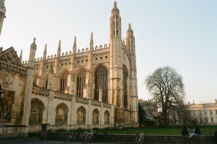
The Facebook snobs turning their noses up at Cambridge’s modern colleges would probably love to know they’re in centuries old company. A seventeenth-century puritan William Dowsing also disapproved of many colleges’ new buildings on his visit to the city in the 1640s. However, these same critics will probably be disappointed to hear that “Smasher Dowsing” destroyed the stained glass of the chapels that they hold in such high esteem. Clearly, not everyone was a fan of new architecture, even then.
Architectural snobbery is still very much alive and well at Cambridge
For many, the attraction of Cambridge is not academic but the rare chance to live in beautiful, often medieval, buildings for less than the rent of a cardboard box in London. But as Alan Bennet writes in his play The History Boys, it’s easy to confuse “learning with the smell of cold stone”. And it’s clear from recent posts on a certain Facebook group that architectural snobbery is still very much alive and well at Cambridge.
Age, as those who’ve dealt with draughty windows and sloping floors, will know well, is no guarantee of architectural superiority, and practicalities must be considered along with aesthetics. All of which begs the question: what is good design?
Initially, there seems to be little connection between classical and modern architecture. Palladio’s use of classical forms and symmetry starkly contrasts with Le Corbusier’s focus on strong horizontal lines and flexible use of space. Both were prolific architects of their day, but each designed very different buildings. But if we dig deeper there are similarities.
At the core is spatial design, something Le Corbusier revolutionised with his concept of open-plan living, just as Palladio did with his series of formal reception rooms. Spatial design, in the case of a college, is used to create an insular community; high walls and gates create enclosed courts and gardens that restrict socialisation.
Other principles such as proportion are equally fundamental, and building to suit human scale is a crucial element in architectural design. For example, horizontal lines on skyscrapers help to emphasise their width rather than their height, and blocking of materials on lower storeys allows the street level to feel more proportionate to the human body.
Even when monumentalism and awe are desired, human-sized elements help ground the space. Cambridge college halls often achieve this through panelling. This serves to divide the vertical space and provide a warmer surface that contrasts the stone or paintwork above. One might consider this like an artificial ceiling; the panelling lowers the perceived height of the room to make its use more comfortable.
Such tricks are employed in all styles of architecture with lots of modern buildings also utilising proportion to favourable effect. Although sometimes deserved, the architectural snobbery towards modern architecture often does not recognise that bad architecture exists in all periods.
This is especially true when the building is considered a landmark. Where architectural experts may observe these faults, the average onlooker is more inclined to perceive anything old and imposing as immediately impressive in spite of its failings.
There is also a clear bias toward ancient stone over the concrete and bricks the modern colleges are often constructed from. Where weathering tends to delicately age and mellow stone and soft brick, it often makes concrete look worn and unattractive. The prevalence of concrete in modernist architecture is the main point of attack for many of its critics and has done much to damage real innovation in architectural design. Of course, there are plenty of examples of modern architecture which successfully make use of natural materials. Larch cladding, which ages to a shimmering grey, is a popular choice found in many episodes of Grand Designs. Modern architecture, unlike classical, also allows for far more experimental forms, reducing the perceived size of a building by blending it into the landscape. Modern does not equal ugly and unnatural, and to tarnish all modern architecture with the same brush is unfair to those buildings that are carefully considered to age well and fit into their environment.
Snobbery presents a false ideal of architecture as a formerly perfect art
Although more modern duds exist than old, it must be remembered that the older buildings we see survived largely because of their merit, quality of construction, and social interest in their preservation. There are many lesser buildings that no longer survive. Snobbery presents a false ideal of architecture as a formerly perfect art and neglects the valuable and beautiful buildings that exist today.
 News / Union elections underway with only one position contested14 March 2026
 News / News in Brief: raging runners, reimagined research, and robotic responses17 March 2026
 News / Union debates officer resigns after misconduct investigation9 March 2026
 News / ‘Race realist’ fellow: College ‘actively encouraged’ protests for my sacking30 January 2026
 Theatre / Faith, doubt, and sanctity in Hamlet in the Chapel18 March 2026


