The Fitzwilliam Museum’s rehang allows for the collection to tell new stories
Robin Stephens reviews the Fitzwilliam’s recently recalibrated display of their collection

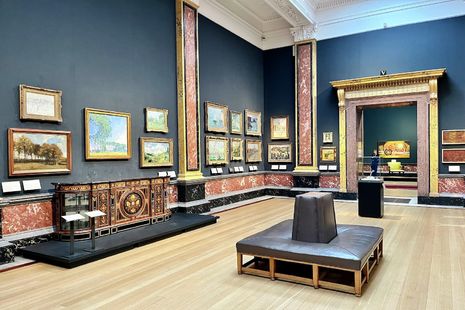
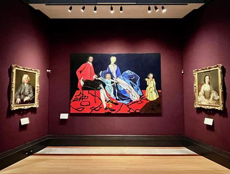
The Fitzwilliam Museum has undergone an extensive rehang. Doing away with the typical chronological ordering of paintings, they are now presented under the banners of several themes: ‘Nature’, ‘Interiors’, ‘Identity’, ‘Migration’, and ‘Men Looking at Women’. The rehang has become the subject of somewhat critical media coverage, focusing on the political side of this curatorial decision. I have to admit, I was initially sceptical at the thought of a thematic rehang at the Fitz. I was concerned that pinning an artwork to a certain theme would reduce diversity of interpretation. However, the rehang seems to me to be a successful – though unfinished – project.
“The thematic focus allows for rich comparisons”
These themes aim to address the historical and ongoing underrepresentation of certain artists and stories within the history of art. As part of the rehang, new works have come on show and captions have been rewritten, alongside the addition of texts explaining the art’s relationship to each theme, and to wider cultural and political ideas. Whereas before the rehang, a walk through the full length of the gallery would take you from Renaissance to Romanticism, Impressionism to Modernism, finishing with Contemporary, now you will find a Picasso just metres from a painting 200 years its senior, united under a certain theme. Once you adjust to this temporal jolt, the thematic focus allows for rich comparisons. The Fitz curators make these assuredly, successfully situating images of women reclining and in bed, opposite a Settee made by Dante Gabriel Rossetti, evoking thoughts of the ‘fainting couch’. These comparisons bring to light the historical depictions of women as fragile or weak, and make the viewer aware of how a supposedly beautiful image may have a deeper story to tell of structural inequalities.

According to curator Dr Rebecca Birrell, the change was partly influenced by the idea that the previous chronological display was too complicated for visitors, a suggestion that feels quite condescending. Dr Birrell told the BBC that the decision to hang works thematically was to counter her view that, “unless you were an art historian or already had an interest in, say, 18th or 20th century art, it was hard to see why they were grouped together in a room”.
“The museum is claiming to champion works by underrepresented artists”
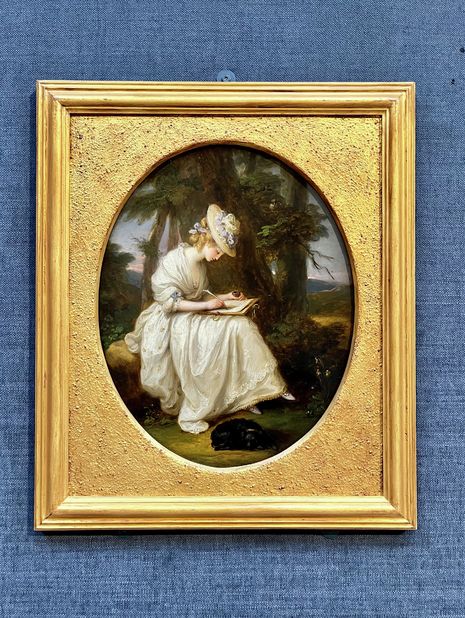
Despite the suggestion that the thematic rehanging would be clearer for viewers, there are some inconsistencies in the rehang. This is most clear in a painting of a woman reading outside under a tree, displayed in the ‘Interiors’ section. In the same thematic area, we find three Degas sculptures of ballerinas, presented crucially without any interior surroundings. The caption very tenuously suggests that these sculptures fit the ‘Interiors’ theme because ‘Degas is best-known for his depictions of women in interiors’. This seems a bit of a stretch to me, and somewhat undermines the intelligent comparisons made elsewhere.

I sometimes questioned the ideas behind the contextualising wall text, especially when across the ornate landing from ‘Interiors’, in the ‘Nature’ room. The works in this section are introduced with the claim that ‘landscape paintings were also always entangled with national identity’. This absolutist declaration that there is ‘always’ a ‘darker side’ of landscapes immediately colours one’s viewing of the paintings in the room. Not only this, but surely this proposition also contradicts the progressive project of the rehang. The museum is claiming to champion works by underrepresented artists, but by displaying them alongside this generalising statement in the ‘Nature’ room, they are in practice presenting them to the visitor without nuance or complexity.

Overall though, the rehang is not as prescriptive as I feared, or as radical as the media coverage may suggest. Within each room, you’re able to move through a theme chronologically, and thus still retain a sense of the path of art history. The captions by and large successfully weave a great deal of different narratives into the broader theme which each artwork sits under. A standout example of this was a section in ‘Men Looking at Women’ which focused on depictions of women from different classes, drawing to light women’s labour and the reality of a life of labour exploitation for the majority of people throughout history. As this comparison showed, a thematic approach is a unique way of telling stories with art that, with a few simple fixes by the Fitzwilliam, could present a fulfilling and insightful history of creativity. Art has always shown us the culture of its time, and the value of this rehang is in its reconsideration of these histories in light of the changing values of our own time.
 News / International students complain of ‘impossible choice’ under Cambridge travel disruption policy28 March 2026
 News / Rowers voice growing concerns about ‘red boat man’ 27 March 2026
 News / Belgian university faces backlash over appointment of ‘race-realist’ fellow31 March 2026
 News / Downing law society banned from holding formals in College for a year31 March 2026
 Comment / Not all is beautiful in the death of the ‘golden ticket’26 March 2026


