Judge a book by its cover? The latest art trends in the publishing world
Gina Stock explores the trends and tendencies that dictate what book covers look like today

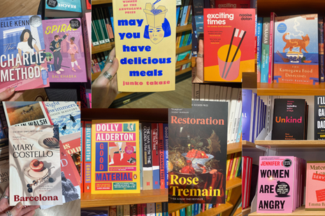
As an avid Waterstones window-shopper and a lifelong reader, I am no stranger to judging a book by its cover. I love a bookshop, and could spend hours in the three-storey Cambridge Waterstones admiring hardbacks, paperbacks, and pretending that I don’t have a dissertation to write. So much thought has to go into marketing a book: we are a shallow people and, like a child in a sweetshop, need to be visually enticed by the product. A book cover needs to incite curiosity, but it also observes the artistic and graphic design trends of its age. This week, I turned my Waterstones procrastination trip into a thoughtful guide on cover art and picked out the current publishing-house trends.
I have quickly learned what to avoid based on my fiction tastes. I am not a fan of romance fiction, which usually identifies itself with faceless, block-coloured illustrations of two people in opposite but complementary outfits to evoke the Romeo and Juliet, forbidden fruit complex that exists in our psyche. A further nail in the coffin for my consideration of the book is if it has been turned into a live-action series and has used a still from the series or film (looking at you, Bridgerton). Reading is an opportunity for our imagination to run wild in a world that attacks us with visual content at all hours of the day. I am not looking to be spoon-fed my mental image of that character just yet.
I do enjoy what I call ‘lost-in-your-twenties’ fiction, which usually uses a similar colourful cover-art style, with absolutely no rendering and an abstract image of eggs, or a toothbrush, or a tin of fish: think Normal People by Sally Rooney.
“Reading is an opportunity for our imagination to run wild in a world that attacks us with visual content at all hours of the day”
Crime and historical fiction are also unmistakably identifiable. Philippa Gregory set the trend of attacking her cover art with William Morris style vines, historical patterns, portraits, and silhouettes, with a font that could have been written with a quill - something which has been adopted by the fantasy genre too. This even extends into the classical re-imaginings that have sprung up over the past few years, for example Circe by Madeline Miller, The Wolf Den by Elodie Harper, or even the dark academia classic The Secret History by Donna Tartt. Crime, murder mysteries, and true crime often use an uneven red border, evocative of blood, or a heavily vintage style that belongs in a newspaper advert from the late nineteenth century. Both these genres use a darker colour palette, usually blacks and reds, to indicate to a potential reader the dangers and excitement that come with the escapism of murder mystery and historical fiction — so far from our own mundane lives.
“Minimalism sometimes feels intensely modern, as if we have cleared the clutter of past extravagant art styles”
A new trend in both debut novels and re-publications of classics is the minimalist style, consisting of a single, abstract photograph or painting, a clear and imposing title in a bold font, and the author’s name. Sometimes, there is a generous sprinkle of one-word reviews, but it is essentially these three elements alone. Minimalism sometimes feels intensely modern, as if we have cleared the clutter of past extravagant art styles and this new, clean aesthetic with a single, framed image is enough to sell the book. This style transcends genre, but commonly includes gut-wrenching contemporary fiction and implicit political commentary, for example the new cover of A Little Life by Hanya Yanagihara or The Vegetarian by Han Kang.
However, the shelves have gone crazy in the past year for an incredibly niche but increasingly common type of cover: the Japanese cat. A copy of We’ll Prescribe You a Cat by Syou Ishida is sitting patiently on my shelf, the cover a cute pastel green, with five cats and an inoffensive typewriter font. Numerous Japanese fictions have been popping up, always with a cat, sometimes with a book, a coffee cup, or a bowl of noodles. These are relaxing fictions that round to a neat and satisfying resolution, and their cover art suggests the read will be like a warm bowl of ramen on a cold day. These covers contrast intensely with another recent Japanese bestseller, Butter by Asako Yuzuki, named Waterstones Book of the Year for 2024, which has a violently yellow cover smeared with bloody fingerprints and finished with an out-of-place illustration of a cow. I can confirm Butter is not a book I’d recommend curling up in bed with.
So, perhaps we should judge a book by its cover as cover art is certainly a telling sign of genre. However, covers are also an unmistakable reflection of current cultural trends, both in art and in literary fashion - perhaps a Japanese bestseller with a cat on the cover is the perfect addition to your bedtime reading!
Want to share your thoughts on this article? Send us a letter to letters@varsity.co.uk or by using this form.
 News / Uni Scout and Guide Club affirms trans inclusion 12 December 2025
 News / Pembroke to convert listed office building into accom9 December 2025
 News / Cambridge Vet School gets lifeline year to stay accredited28 November 2025
 Features / Searching for community in queer Cambridge10 December 2025
 News / Uni redundancy consultation ‘falls short of legal duties’, unions say6 December 2025


